


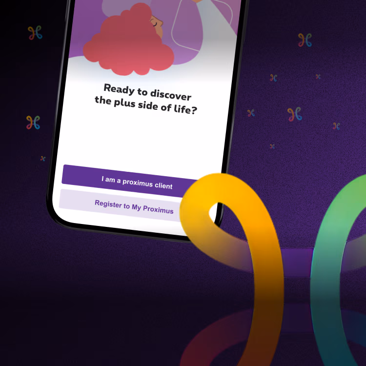

Assessing the UX of Argenta’s mobile app
In today’s decade of design, customer experience has reached paramount importance. A message that Argenta understood as no other when they reached out to us for a complete UX audit of their mobile app. Setting off with an ambitious app store score of 4.5, we’ve been asked to challenge them even more to turn UX into their ultimate competitive advantage. And that in only 6 weeks.
The challenge
Fuelling “not just great” but superior UX for the future of Argenta’s mobile banking app
Solution
Delivering a full-fledged assessment of both Argenta’s current mobile app and future roadma
Approach
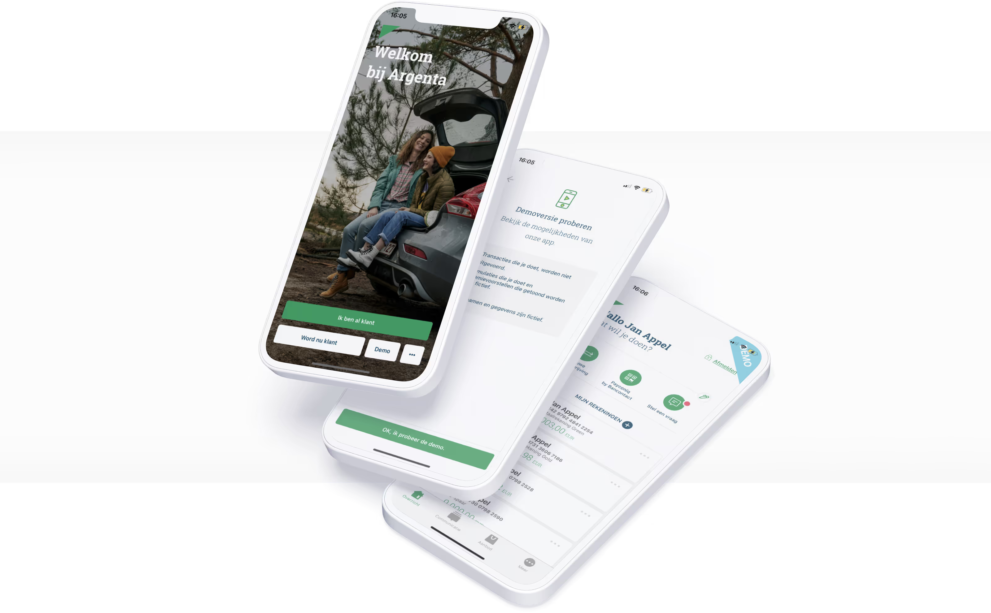
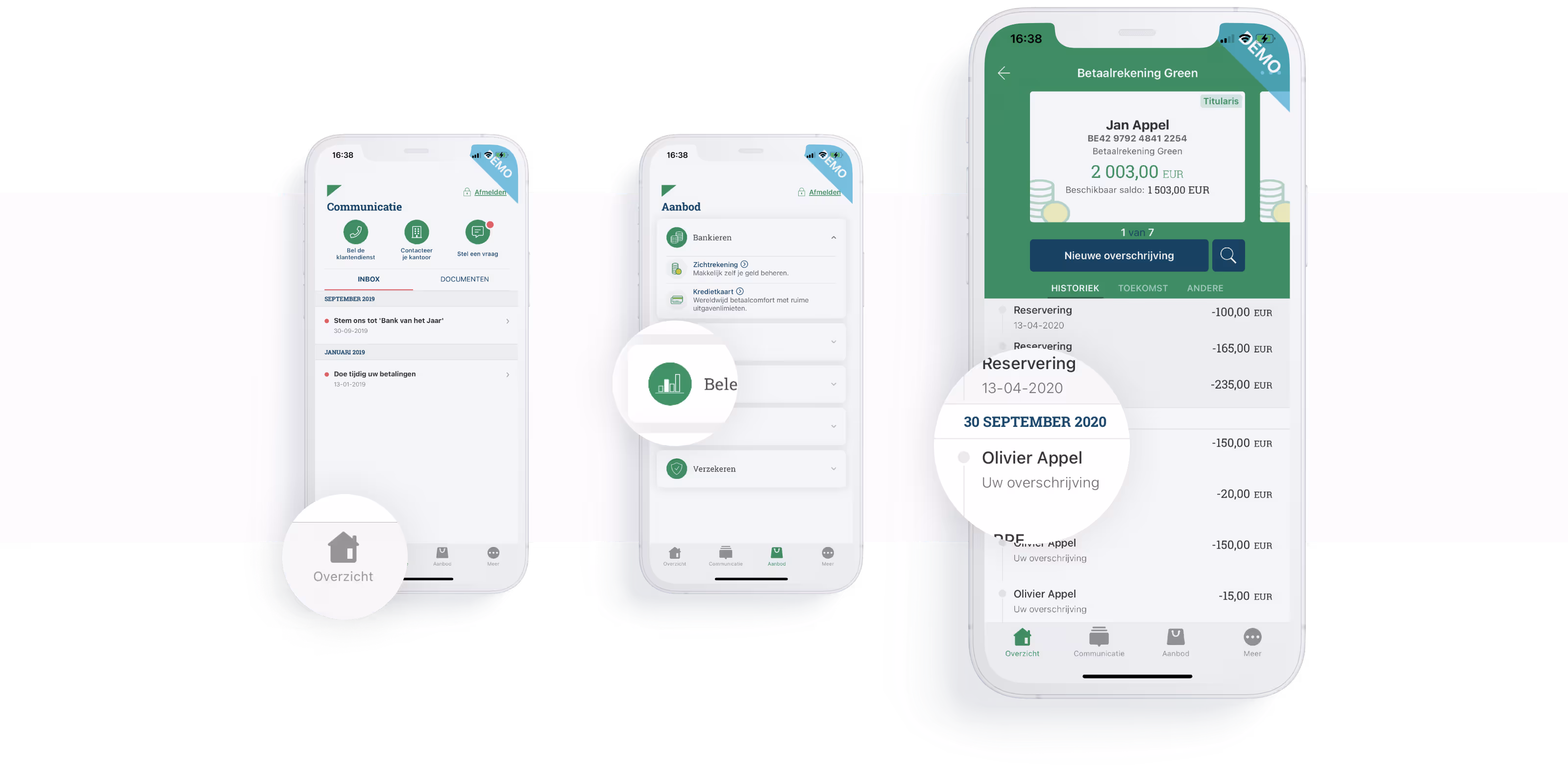
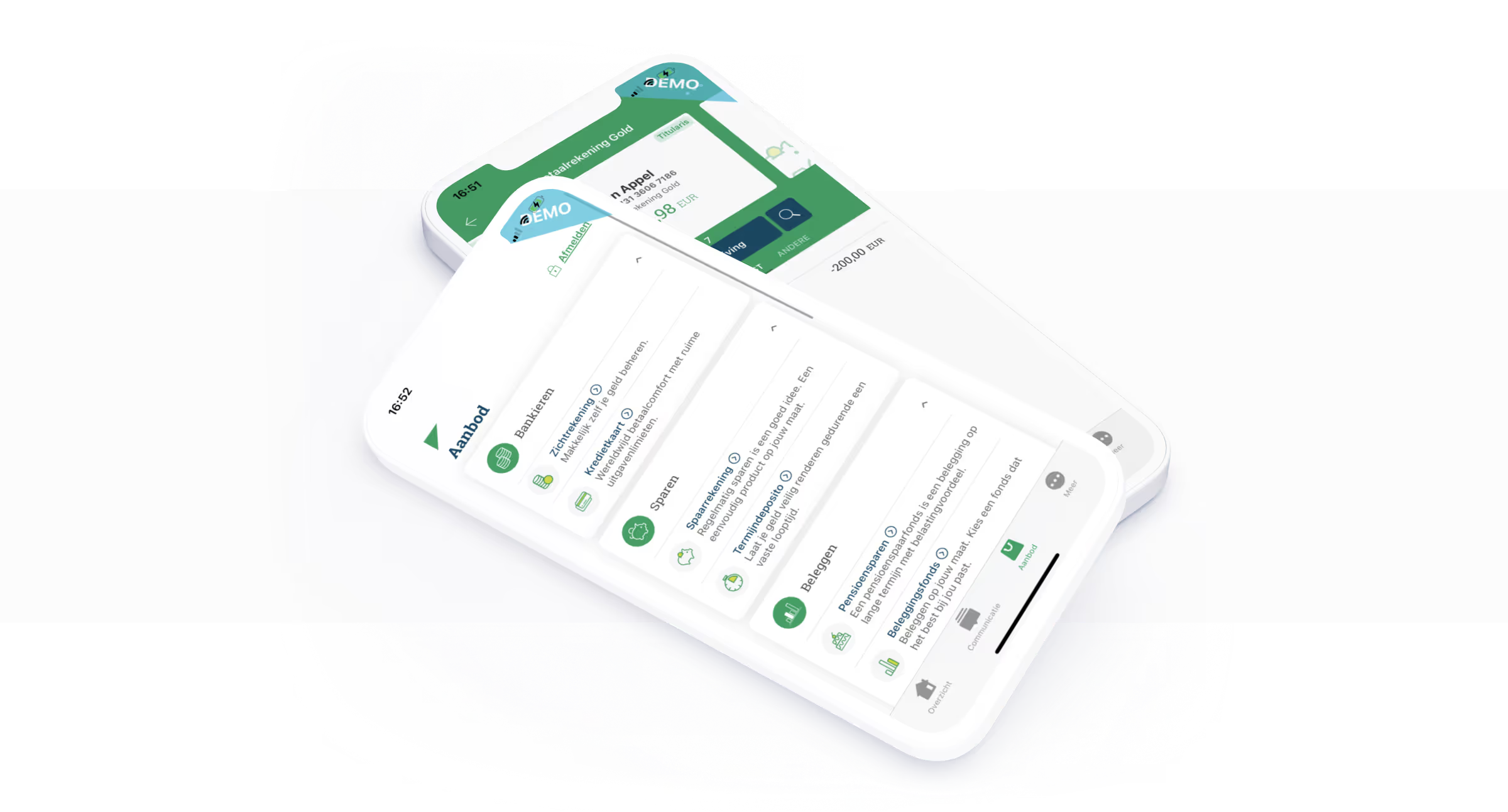
Assessing the current UX of the Argenta mobile app
Outcome
Argenta is ready to fully leverage UX as their main competitive advantage

Challenge
When Argenta approached us, they were on a twofold UX quest. Short term: how were their users experiencing the current mobile app? And long term: how would the planned roadmap satisfy the mobile banking needs of the modern digital-savvy user?
Their goal was to streamline the entire mobile experience and sharpen their future scenario while still complying with the strict set of compliance rules typical for the banking system.
To complement their in-house team of experts, Argenta was looking for that challenging outside-in perspective. And that’s exactly what we put to the table: cross-UX expertise from various sectors. By including these new perspectives, Argenta was able to understand how users more than ever raise the bar for outstanding UX encounters.
Solution
In the Pocket’s mission for Argenta? Delivering a full UX assessment of its current mobile banking experience, highlighting key UX strengths, improvement areas and gaps. To build a strong foundation for this, we harnessed the insights from both analytics reviews and user testing.
A comparison with a national and an international key competitor allowed us to benchmark the UX performance even better and sharpen Argenta’s future plans.
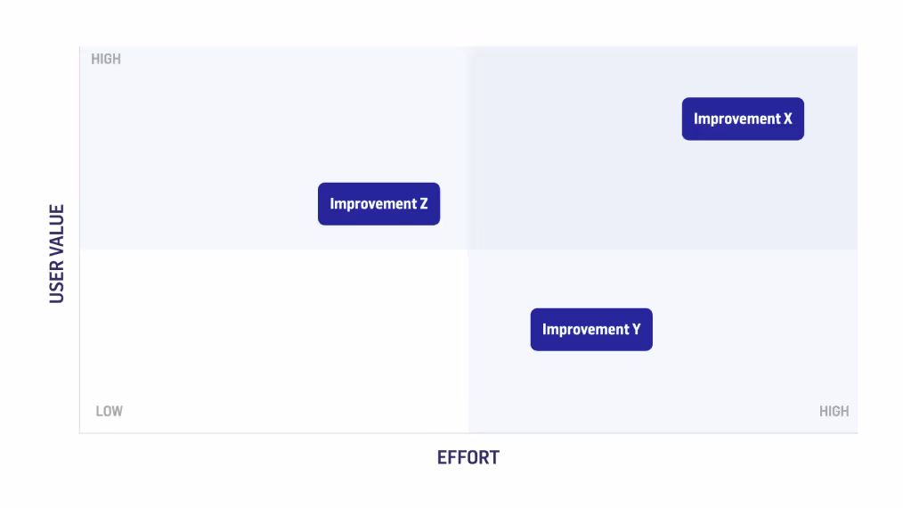
Finally, to challenge and shape their roadmap, we worked towards design recommendations for the top 10 prio UX improvements. Not losing ourselves in little tweaks and fixes, we delivered full concepts that took both benefits and potential risks or complexities into account. Design mock-ups were made for every recommendation to clearly visualize what it would look like in the app.
Building on more than a decade of experience, we know what it takes to create a winning UX strategy. That’s why we delivered all of the above in just 6 weeks.
"In a matter of weeks we got a complete review of our current mobile app, filled with both small and big recommendations on how to improve the user experience. This document will serve as a UX Bible of sorts to guide our product roadmap."
Tanja Van der Peet - Customer Journey Expert at Argenta
Approach
What did this 6-week process look like? As UX audits are part of our core offering, we confidently set up a tailored fast-paced track to tackle Argenta’s challenge.

Understanding through heuristic expertise and a competitive analysis
Diving into the project, we sat together with the team to get a grip on their strategy, target audience, current app and its usage. Complementary to the Argenta team, we assembled a team of a product designer, UX strategist and digital analyst: the perfect match to get on with the UX review of Argenta’s mobile app.
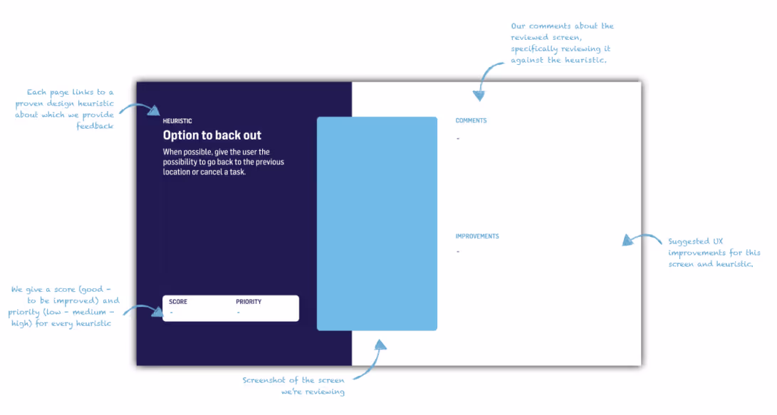
The first audit included a review across 50+ heuristics and 70+ design principles. Covering all keys flows of the application (f.ex. onboarding, transactions, card services etc.) this formed the base for our assessment. Along with the Argenta UX Audit, we performed the same (full) audit on both a national and international competitor app.
Validating through data & user insights
Building on our own expertise, a data analyst analysed the usage and conversion data of the same flows to deeply understand how clients currently use the app. Finally, we want to hear it from the clients as well, so spending time listening to the user was another key element of this UX assessment. One-on-one user interviews allowed us to add another qualitative layer to our own findings and the analytics insights. As with the previous stage, we both focused on the current usage as on some of the envisioned future features.
Defining by prioritising
Checking back in with the Argenta team, it was time for an audit debrief presenting our findings, the key UX strengths & points of improvement. Together we prioritised the most impactful UX refinements and defined their business, technical and regulatory impact.
Shaping what’s next through design recommendations
Entering the final phase, we were ready to create our design recommendations and showcase our conceptual way of thinking. That’s when we introduced the team to our concept sheets. For all 10 defined prior improvements, we listed a description of the recommendation and where it fits in the customer journey; key benefits, potential risks and a couple of inspirational mockups of what it could look like in Argenta’s app.
Examples of recommendations that came from our extensive evaluation included:
- Increase the consistency of components like input fields to make data entry predictable and thus faster & less error-prone.
- Use platform-standard gestures like “swipe to go back” or “swipe to dismiss” and leverage haptic feedback to emphasize successful or faulty actions
- Shorten long acquisition flows and limit the amount of screens and taps you need to complete frequently used actions
- Restructure the main navigation to align better with daily usage and make app sections obvious to users.
Outcome
By sharpening the UX design of its current app and thoroughly assessing the future priorities, Argenta is ready to stand out from its competitors. Our UX audit gave them a clear view of where their mobile ship should steer towards and which gaps to bridge.
Fulfilling our role as an outside challenger, new perspectives in line with their corporate strategy are ready to be implemented. With a toolbox full of UX improvements, they are more than ever equipped to easily navigate in a landscape filled with mobile challenger banks.
"In The Pocket was an ideal partner here: they not only had a structured approach in which they made recommendations from different perspectives, but they went all out for collaboration in order to get the most out of this exercise."
Bart De Bodt- Head of Digital Experience & Sales at Argenta


.avif)
.avif)
Fulfill your ambitions
We'd love to hear about your next challenges. Let's take the first step towards achieving your business goals. No strings attached.
Let's chat