Building an accessible Flutter app for Bancontact Pay
Milan Vanalderwerelt
Digital Product Designer
When our team at In The Pocket rebuilt the Bancontact Pay app in Flutter, we expected accessibility to be straightforward. After all, we'd done it before in native development. We quickly discovered it required a fundamentally different approach.
Features that came naturally in native required completely different approaches in Flutter. Screen readers that once worked smoothly now read out dozens of items sequentially. Error messages that were clear became confusing. Simple navigation became a maze.
This wasn't just about following a checklist. We had to rethink our entire approach to accessibility in Flutter, and what we learned applies to any team making the same transition.
Starting With Our Initial Tool Set
We began with our internal audit tools, following the European Accessibility Act guidelines that took effect in 2025. We identified key areas for improvement in the Flutter rewrite. Then, we prioritised features based on how often users used them. We created a checklist.
It seemed straightforward until we began testing with actual screen readers. That's when we realised that features we believed were accessible turned out to be difficult, or even impossible to use.
Building Our Accessibility Approach
The design system was rebuilt to be more flexible and future-proof with improved colour contrasts. Tap areas, text scaling, and clear descriptive copy that also translates without seeing the context were taken into account.
Animations help with flow and experience, but you can turn them off if they clash with accessibility tools like screen readers.
We decided to implement some parts later due to time constraints; therefore, a priority list was set up focused on the user. The app needs to be usable for all users at the first release.
Regular design reviews are a necessary part of the process. Later, we built a strong base of screens. Then, we checked for screen reader compatibility and solid semantic structure (iOS - VoiceOver, Android - TalkBack). When testing with screen readers and enlarged text, we found many usability gaps that were not obvious at first glance.
Solving Common Patterns
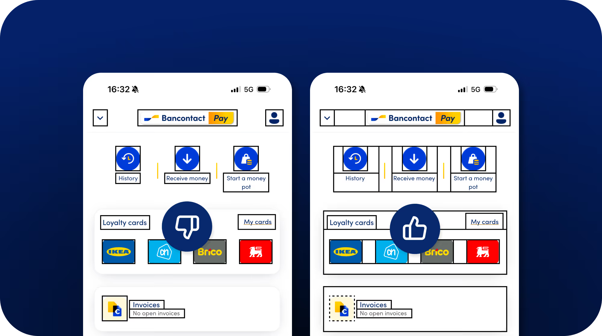
Initial versions read each element on the screen one by one. This meant users had to listen to many items before finding what they wanted. We solved this by grouping related items. For example, we combined "loyalty cards" with the group name, the item count, and a description into one focusable element.
Another case was tab navigation implementation. We initially had each tab announced simply as "Home" or "Wallet." We improved this to "Navigation tab, Wallet, 2 of 3 selected" to provide context about position and state.
For bank cards, the screen reader announced "KBC card ******8284", reading each asterisk individually. This is not pleasant to hear. Thus, we set it up as "KBC card ending on 8284" instead. It provides the necessary information while maintaining privacy without distracting and unnecessary add-ons.
Labels had to be added in code that would only be read out loud; these labels had to be gathered for translations as well. This cannot be overlooked.
We checked if error messages were read aloud. We also changed vague descriptions like "Invalid amount" to clearer ones, such as "Invalid amount: Amount can't be higher than 500 euros." This helps explain the problem and the solution.
These were situations where reviewing as a screen reader user was necessary to immerse oneself and see what was clear and what was not.
Many of these groupings and naming conventions make sense and apply to every item, like a button. We needed to ensure they are read aloud in the same order and with the same names for clarity and consistency. Defining these names with the team is an important step in the process (e.g., "View invoices, button", not switching between the naming conventions of button and link).
There are still special cases. We agreed that these need to be mentioned specifically in the design file next to the screen or in refinement for clarity in development.
Tackling Tricky Cases
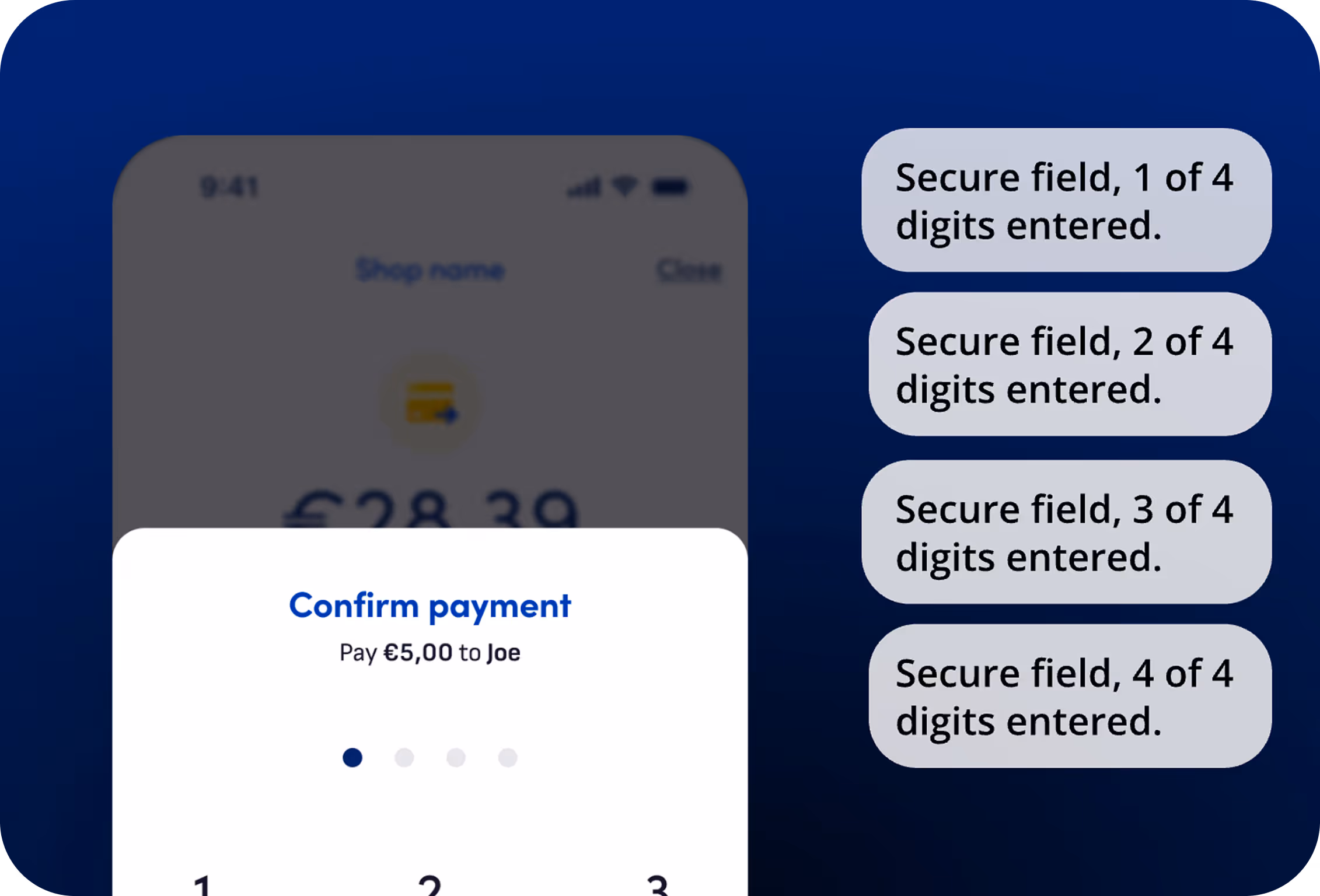
Some cases were tricky to balance. For PIN entry, another challenge emerged. What gets read aloud?
We checked with security to find the most secure way for validation. While the PIN pad uses the same screen reader usability as normal, the numbers get read aloud.
We did change the audio of the input. Our solution uses a pattern like "Secure field, 2 of 4 digits entered" to provide progress feedback without revealing specific digits in the PIN itself.
Refinement and expertise helped us decide the best case for each scenario.
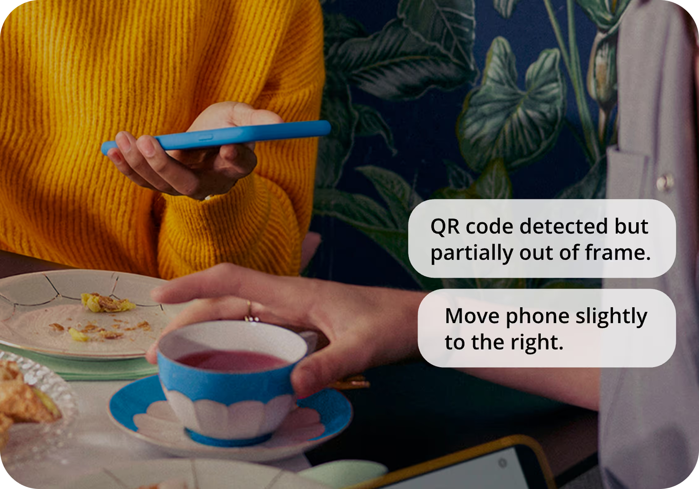
Testing with screen readers revealed gaps that no checklist could catch. Camera-based features like QR code scanning became completely unusable without visual feedback. A visually impaired user would point their camera at a QR code, hear nothing, and have no way to know if they were pointing at the code.
We consider audio guidance similar to what Onfido uses in their KYC flow. Imagine hearing "QR code detected but partially out of frame; move phone slightly right" instead of failing in silence.
Loyalty cards present a similar blocker. Not all cards have scannable barcodes; some have only printed numbers. For visually impaired users relying on screen readers, it is a complete barrier.
One solution is to offer another way to access the number. This could be through audio feedback that says there is no barcode and reads the numbers aloud for entry. Even better, the system could detect the number and fill it in automatically, then provide audio feedback to confirm this action. We do want to implement these in the future to ensure an easy user experience.
These discoveries are identified for future improvement. They reinforce a critical lesson: accessibility isn't about retrofitting existing features. It's about identifying the key barriers in your app and rethinking how those features should function. Checklists tell you to add labels and contrast, but actual testing shows you where your app simply doesn't work at all or fails in quality of use.
What We Learned
With the knowledge we had, we began checking off the requirements. However, testing only in specific situations or with limitations provided us with these insights.
Here's What Our Framework Now Includes:
Test early and often:
Don't wait until screens are "done" to test accessibility. After every feature, screen, or component, check text scaling, contrast, and screen reader behaviour. This builds a solid foundation and prevents cascading fixes later.
Define conventions upfront:
Establish naming conventions and semantic patterns during the design phase, not during development. Document how buttons, links, and interactive elements should be announced. Consistency matters; switching between "button" and "link" terminology confuses screen reader users.
Plan for special cases:
Identify tricky scenarios during refinement. Add these directly to design files so that developers know they need custom handling.
Create screen reader scripts:
For complex screens, map out exactly what should be read and in what order. This helps developers implement consistent semantic structures. After the team becomes familiar with the patterns, these scripts can be simplified to cover only special cases.
Let implementation shape the framework:
What came more naturally in native development required more guidance in Flutter. We shaped our approach through practical implementation, not theory.
The reality is that generic checklists aren't enough. Accessibility solutions are specific to each project and use case. And while our team testing improved things significantly, we know only actual accessibility users can give truly meaningful feedback. In future projects, we will include them during development, not just at the end.
Tools That Helped Us
We found several tools particularly valuable during our accessibility implementation:
Flutter's Semantics Debugger for visualising how screen readers interpret our UI.
Accessibility Scanner for the automated testing of common issues.
Contrast analyzers to verify our colour choices against WCAG standards.
VoiceOver and TalkBack screen readers for real-world testing.


.avif)